Exponential Functions
Dataset
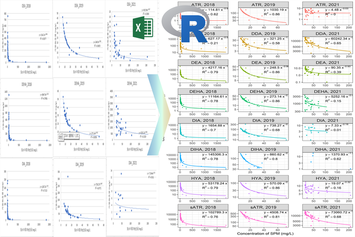
Across fields, we want to explore how our data changes with other variables. In many circumstances with an equation that is different from linear. Exponential equations are among the most common ones, and Excel may be one of the straightforward and simplest software to do them. R doesn’t have those easy build-in buttons, but with some code, we can make it faster, better, and of course, reproducible. Let’s begin by adding our libraries and creating a random data set:
library(broom)
library(tidyverse)
set.seed(15)
df=structure(list(x = c(250, 300, 500, 700, 900),
                  y = c(8,6,4,2,1)),
             .Names = c("x", "y"),
             row.names = c(NA, 5L), class = "data.frame")
Now we will practice how to add data sets together and bind rows, as well as adding new variables.
Equation
df=rbind(df,df)
df$group=c(rep("a",5),rep("b",5))
df$year=c(rep(2015,3),rep(2017,2),rep(2015,2),rep(2017,3))
variables=c("group","year") #if you have multiple groups/seasons/years/elements add them here
This part will do what excel does to get that exponential equation: lm(log(y) ~ log(x). It actually takes the log of your variables and runs a linear regression. We will do that for as many groups as we have and select the values that we want.
text=df %>%
  group_by(across(all_of(variables))) %>% #your grouping variables
  do(broom::tidy(lm(log(y) ~ log(x), data = .))) %>%
  ungroup() %>%
  mutate(y = round(ifelse(term=='(Intercept)',exp(estimate),estimate),digits = 2)) %>%  #your equation values rounded to 2
  select(-estimate,-std.error,-statistic     ,-p.value) %>%
  pivot_wider(names_from = term,values_from = y) %>%
  rename(.,a=`(Intercept)`,b=`log(x)`)
R-square
R2 is also essential; in the same way, we will use some functions and calculate that for multiple groups.
rsq=df %>%
  split(list(.$group,.$year)) %>% #---- HERE add the names after $
  map(~lm(log(y) ~ log(x), data = .)) %>%
  map(summary) %>%
  map_dbl("r.squared") %>%
  data.frame()
Data and equations
Now, let’s join those data sets and write the equations for our plots.
#Join the R2 and y results for the plot in a single data frame and write the equations
labels.df=mutate(rsq,groups=row.names(rsq)) %>%
  separate(col = groups,into = c(variables),sep = "[.]",
         convert = TRUE, remove = T, fill = "right") %>%
  rename("R"='.') %>%
  left_join(text,.,by = c("group", "year")) %>%
  mutate(R=round(R,digits = 4), #round your R2 digits
    eq= paste('y==',a,"~x^(",b,")", sep = ""),
         rsql=paste("R^2==",R),
         full= paste('y==',a,"~x^(",b,")","~~R^2==",R, sep = ""))
Plots
I use ggplot2 to draw most of my plots; the following code will give you some good-looking figures and save you a lot of time if you have many variables.
ggplot(df,aes(x = x,y = y)) +
  geom_point(size=4,mapping = aes(
    colour=factor(ifelse(is.na(get(variables[2])),"",(get(variables[2])))), #points colour
    shape=get(variables[1]))) + # different shapes
  facet_wrap(get(variables[1])~ifelse(is.na(get(variables[2])),"",get(variables[2])),
             scales = "free",labeller = labeller(.multi_line = F))+ #for multiple groups; join text in one line
  stat_smooth(mapping=aes(colour=get(variables[1])), #colours for our trend
              method = 'nls', formula = 'y~a*x^b',
              method.args = list(start=c(a=1,b=1)),se=FALSE) +
  geom_text(labels.df,x = Inf, y = Inf,size=5, mapping = aes(label = (eq)), parse = T,vjust=1, hjust=1)+
  geom_text(labels.df,x = Inf,#ifelse(labels.df$Year=="2018",1000,ifelse(labels.df$Year=="2019",40,100)),
            y = Inf,size=5, mapping = aes(label = (rsql)), parse = T,vjust=2.5, hjust=1)+
  #scale_y_log10() + #add this to avoid problems with big y values
  labs(x="Your x label",y="Your y label")+
  theme_bw(base_size = 16) +
  theme(legend.position = "none",
        strip.background = element_rect(fill="#b2d6e2"))
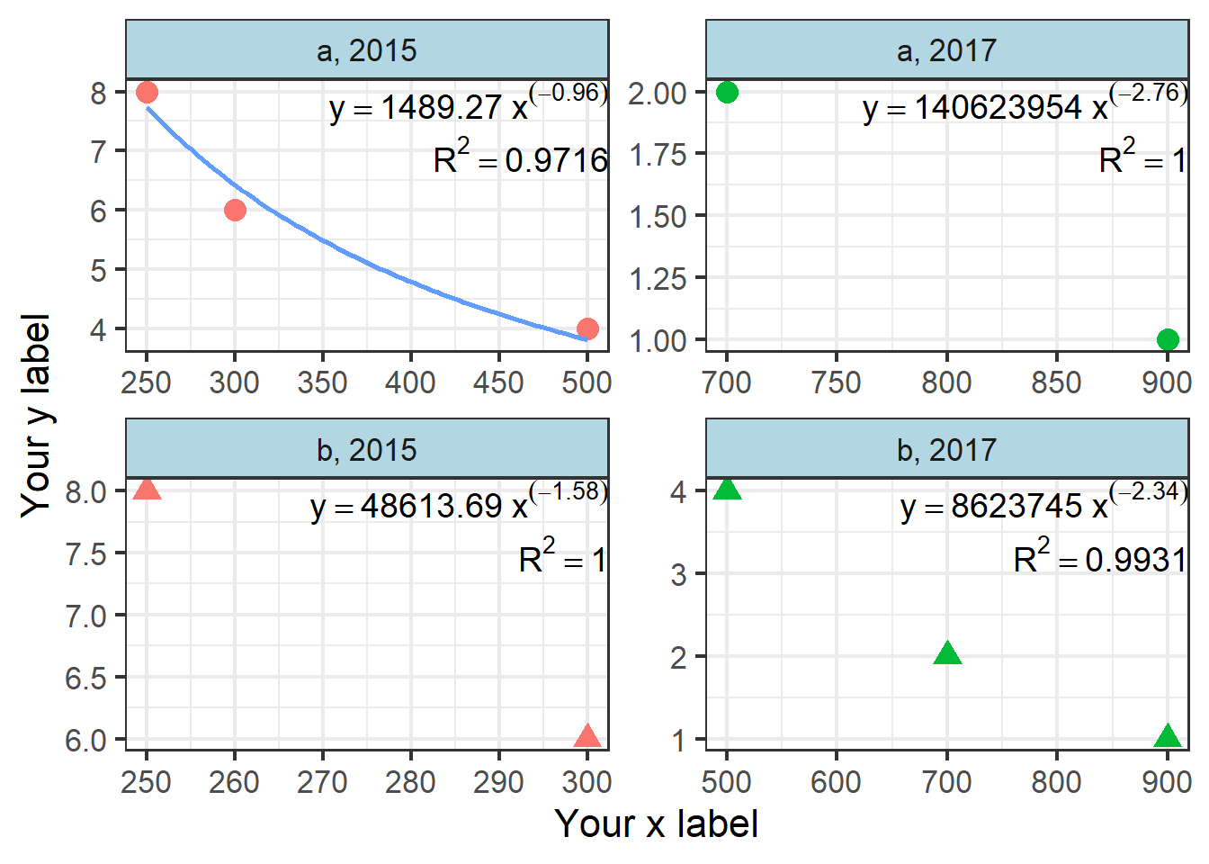
Some plots don’t have a regression because of limited points or linear relationships
Well, that is what you need to get those equations, statistics, and figures. You can change different parts for further analysis or meet your requirements.
Just the code
With your dataset, use these steps to get your results. Also, change the variables name used in rsq calculations accordingly.
df= #change your data frame so it fits the current code
variables=c("group","year") #if you have multiple groups/seasons/years/elements add them here
df$y= #which variable will be your y
df$x= #which variable will be your x

#No changes to get the equations
text=df %>%
  group_by(across(all_of(variables))) %>% #your grouping variables
  do(broom::tidy(lm(log(y) ~ log(x), data = .))) %>%
  ungroup() %>%
  mutate(y = round(ifelse(term=='(Intercept)',exp(estimate),estimate),digits = 2)) %>%  #your equation values rounded to 2
  select(-estimate,-std.error,-statistic     ,-p.value) %>%
  pivot_wider(names_from = term,values_from = y) %>%
  rename(.,a=`(Intercept)`,b=`log(x)`)
# --CHANGE before running!!-- add your grouping variables
rsq=df %>%
  split(list(.$group,.$year)) %>% #---- HERE add the names after $
  map(~lm(log(y) ~ log(x), data = .)) %>%
  map(summary) %>%
  map_dbl("r.squared") %>%
  data.frame()
#Join the R2 and y results for the plot in a single data frame and write the equations
labels.df=mutate(rsq,groups=row.names(rsq)) %>%
  separate(col = groups,into = c(variables),sep = "[.]",
         convert = TRUE, remove = T, fill = "right") %>%
  rename("R"='.') %>%
  left_join(text,.) %>%
  mutate(R=round(R,digits = 4), #round your R2 digits
    eq= paste('y==',a,"~x^(",b,")", sep = ""),
         rsql=paste("R^2==",R),
         full= paste('y==',a,"~x^(",b,")","~~R^2==",R, sep = ""))
# plot
ggplot(df,aes(x = x,y = y)) +
  geom_point(size=4,mapping = aes(
    colour=factor(ifelse(is.na(get(variables[2])),"",(get(variables[2])))), #points colour
    shape=get(variables[1]))) + # different shapes
  facet_wrap(get(variables[1])~ifelse(is.na(get(variables[2])),"",get(variables[2])),
             scales = "free",labeller = labeller(.multi_line = F))+ #for multiple groups; join text in one line
  stat_smooth(mapping=aes(colour=get(variables[1])), #colours for our trend
              method = 'nls', formula = 'y~a*x^b',
              method.args = list(start=c(a=1,b=1)),se=FALSE) +
  geom_text(labels.df,x = Inf, y = Inf,size=5, mapping = aes(label = (eq)), parse = T,vjust=1, hjust=1)+
  geom_text(labels.df,x = Inf,#ifelse(labels.df$Year=="2018",1000,ifelse(labels.df$Year=="2019",40,100)),
            y = Inf,size=5, mapping = aes(label = (rsql)), parse = T,vjust=2.5, hjust=1)+
  #scale_y_log10() + #add this to avoid problems with big y values
  labs(x="Your x label",y="your y label")+
  theme_bw(base_size = 15) +
  theme(legend.position = "none",
        strip.background = element_rect(fill="#b2d6e2"))
Roberto Supe
PhD Student of Environmental Science
My research interests include data analysis, environmental pollution, risk assessment, climate change, and ecology.